Forms
General rules
The name of the form must accurately describe it. The user must immediately understand what this form is meant for. Sometimes, it may be OK to add a description but only when it is absolutely necessary.
The field names must reflect their purpose. Do not use abstract names or abbreviations.
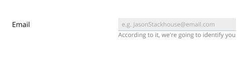
Alleviate apprehension concerning personal data. If an input field takes personal information (telephone number or e-mail address), let the user know what you intend to use this data for. Supplement that input field with a short explanation, one short sentence will be enough. Use the hint element to do it.
Emphasize the element the user is working with. The focus on that element must be visible and unmistakable.
Distinguish the inactive elements. Active and inactive elements must look different. Provide tips when it is not obvious what actions can lead to the element switching from inactive state to active. The user must understand why an element is inactive, and what should be done to make it active.
Navigating the form elements must be possible using the keyboard. Make sure the mouse clicks are not the only means of navigation.
The sequence of actions must be linear. Nothing should be able to slip the focus.
All elements must be clear to understand. Do not invent new types of control in place of the regular ones.
All messages shown to the user must be clear and to the point. Do not compose messages out of generated phrases.
Use links for navigating to other pages or sections and to open new windows. A link must describe the location that the navigation leads to, it must not contain a call to action. A link does not initiate an action – that is the function of buttons.
When placing content in two columns, put the input field captions above the input field. This way, it is more clear that the caption belongs to this input field.
Select
Both checkboxes and radio-buttons can be used. The checkbox should be used when it is clear that when the user enables it, they will get a specific result. Sometimes, a set of radio-buttons better conveys the essence of the choice. When picking from up to 5 options, it makes sense to use the radio-buttons. Choosing from 6 to 10 options – a dropdown or a select-box. More than 10 options – a select-box plus a search.
Single option
Good example: Enabling an additional property using a checkbox next to the main input field.

Good example: Choosing from two obvious alternatives.

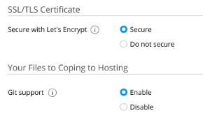
The radio-buttons must always be used for enable/disable type of action.
If the user’s acceptance or confirmation is prompted (e.g., accepting the terms of the Privacy Policy), the checkbox must be used.
Good example: Enhancing user experience by choosing the right elements to use.
| Before | After |
|---|---|
 |
 |
- Replaced checkboxes with radio-buttons,
- Forumlated succinct and clear names for the controls,
- Recreated explanations as tips, they will appear when the user clicks on the icon,
- Aligned all elements to one grid.
Note: Not all descriptions and explanations need to be represented in the form of tips. If an explanation consists of 2-4 words, it is best to place it by the input field – as was described in the General rules.
Poor example: Uncertain effects of the action.

It is unclear what the results are supposed to be: “If the checkbox is enabled, will it or will it not work?” This kind of implementation is not recommended.
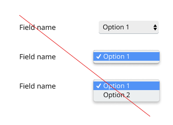
Bad example: Using dropdown lists.
Up to 5 options
Good example: several checkboxes.

No option is selected by default. Or, if it is known that most of the time the users select most of the options, all options may be enabled by default.
Good example: several radio-buttons.

One of the options is enabled by default. The most popular or the most important option is usually chosen.
Bad example: dropdown unnecessarily short.
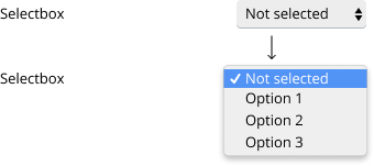
These four options fit perfectly into a small radio-buttons group. The negative of a dropdown is that the user cannot know what they will see when the dropdown is open. The radio-buttons group is the obvious choice in this case.
Dynamically loaded options
There must be an understanding of how many options may be loaded. Depending on the expected numbers, the decision can be made on which type of element to choose for implementation.
Buttons
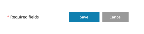
The form can have only one primary button. All other buttons must be secondary.
Buttons’ captions must be calls to action. Good examples are Save, Create, Start. Ideally, the caption should contain just one word – a verb. Captions like OK, Yes and No do not inform the user of what actions will be launched when the button is pressed and, therefore, are not the best choice.
Password
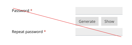
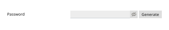
To insure the new password is specified correctly, enable the user to see their input. Asking the user to enter their new password twice is not the best way.
The user must be responsible for what characters their choose to use in their password. The security system should not impose strict requirements in this matter. It should inform the user of how safe the password they have chosen is.
Bad example: The new password is entered twice.
Good example: The user may choose to see the password they enter.
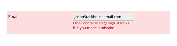
Validation
If the user makes an error while filling out the form, this error needs to be detected before the form is submitted. Ideally, before the focus has been moved onto the next input field.
The user must be informed of the error in a way that is not stressful and offered a way to fix it. If the error cannot be detected before the form is submitted, once the form has been submitted the focus must be placed on the first input field containing an error to let the user fix it.
Note: Use in-line validation. Check the entered data right after it has been entered. This will allow to decrease the number of errors and the time the user spends filling out the form, and increase conversion and user satisfaction.
Required fields
The required input field indicators are optional. If the form contains no required fields, that information is unnecessary and should not appear.
Do not include unnecessary input fields into a form. Ideally, all the fields of the form should be necessary to be filled in. The user must be informed that the required input fields are marked.
Note: Do not ask the user to provide more information than necessary. Trying to collect too much data wastes the user’s time and results in decreased user satisfaction.
Grouping
Use sections to group similar information.
Sections can be collapsible and non-collapsible. Place additional, less important input fields that the user may choose to fill in later in the collapsible sections.
Input fields
- Like other elements, the input fields must appear the way the users are accustomed to.
- Specify the type of data that will be entered in the input field (numerical, text, e-mail, phone number, etc.).
- The length of the input field depends on the type of entered data.
- Field captions must be understandable and sound clear when processed by screen readers.
- Use tips where necessary.
- Use the data that has already been entered. The input fields must remember what the user may have already forgotten. Asking twice or more for the same bit of information is impolite. For example, if you have signed up for a mailing list on a web site once, when you are registering at that web site, it should remember you and fill your e-mail address in to the appropriate input field.
- The length of the input field usually reflects the size of the data to be entered there. The input fields that are used for lengthy mailing addresses are large. The input fields used for a 6-digit postal index are short.
Input field tips
The most simple and helpful way to tell the user how to fill in an input field is to show an example as a placeholder.
Explanations
This type of descriptions explains to the user how the information they enter will be used. For example, “We will use your e-mail address to send you notifications of changes in the status of your order. We will not send spam.”
Input field length
- Phone number: 12 characters;
- IP address: 15 characters (including the separating periods);
- Name: 300 px;
- Minimum size field: 64 px (for short numerical values);
- Password: 200 px.