Lists
List composition
The lists are used for displaying large quantities of objects of the same type.
Toolbar
The controls that manipulate a list are included in the list toolbar.
The controls are grouped by their function. The first group of controls manipulate the contents of the list. This group is aligned with the left edge of the list and includes the following:
- button(s) that add new list elements,
- buttons that modify the state of the list elements (editing, updating, cloning, synchronization, etc.),
- buttons that delete elements or properties.
The second group of controls manage how the list is displayed. This groups is aligned with the right edge of the list and may include the following:
- sorting,
- filters,
- display mode (table, cards, tiles).
If the number of objects in a list is great, the list is split into pages, and the pagination controls are displayed.
List display modes
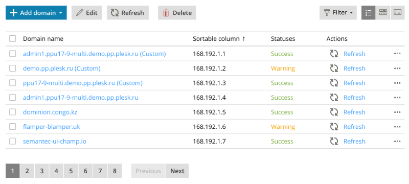
Table
The table display mode is used for displaying lists with large numbers of objects that require no visual representation. Such lists can contain data, status information, small quantities of tools or links.
The columns must always follow this order:
- checkbox (if necessary),
- name,
- attributes (all properties that need to be displayed),
- status information,
- actions,
- additional data and operations.
It is not required to display all available columns – the best practice is to show the necessary minimum.
List entries are subject to group operations. To facilitate group operations on a list the following controls are used: the checkboxes for selecting the objects for an operation, and the buttons in the toolbar above the list for launching appropriate actions (deletion, cloning, activation/deactivation, etc.).
Item list
The item lists display objects in a form of a grid. Each element of the item list has an icon, a name and a control for launching an action.
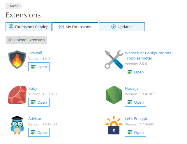
The item lists are suitable for displaying objects with a visual identifying property. For example, the item list is used to display the list of extensions, where an extension’s icon is a unique identifying property for each object. The name and version number of the extension and a button Open (or Buy, etc.) are also displayed.
Card list
The objects in the card lists are displayed in the form of cards, which include screenshots or previews and unique sets of tools. This display mode is suitable for objects like web sites, WordPress instances, etc.
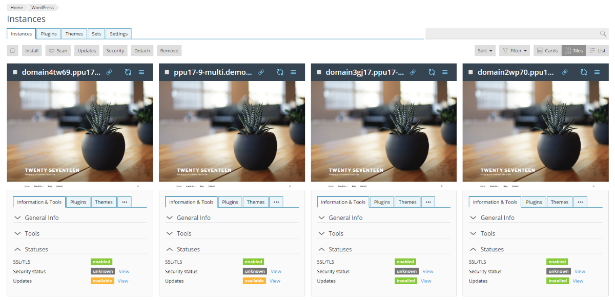
Such lists can be manipulated in all the same ways as other types of lists, including group operations.
The card lists allow for additional different ways of displaying the objects: as cards (all information and controls visible), as tiles (smaller than ‘cards’, some information and controls are hidden), as list or tables.
Pagination
The pagination is a way of displaying large volumes of content by splitting it into discrete pages. Pagination should be used when all other ways of structuring information (categories, filters) have already been used. The size of the page should be chosen so that it is neither too large or too short. The optimum size of a page is 2-3 screens.
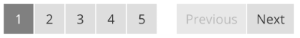
The pagination controls include buttons with page numbers and buttons “back” and “forward”. Depending on the situation, it may be all of them, or only the page numbers, or only the “back” and “forward” buttons. The latter option is optimal when a list is supposed to be viewed on smaller screens. The buttons “back” and “forward” must accompany the page number buttons in case there are 7 or more pages, otherwise the page number buttons only are sufficient.
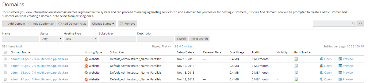
Searching and filtering
The search bar is used to look for specific objects. It is usually a part of a toolbar or a tabs bar. Infrequently, it can be an independent element placed above the list to the right.

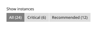
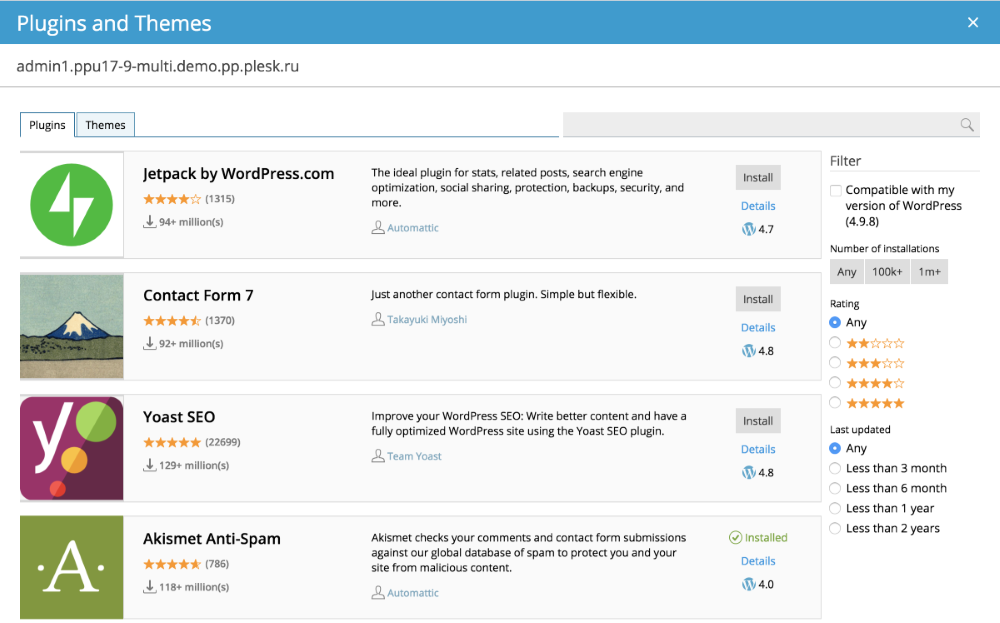
Filtering is another approach to searching, which involves isolating sets of objects based on their specific attributes, like status, dates, etc. Filtering can be quick and exhaustive.
Quick filtering is using integrated filtering algorithms. To implement this kind of filtering, the segmented control should be used, which allows to quickly switch between a few predefined options similar to how radio-buttons work.
Another way to implement quick filtering is with the help of a dropdown list, which contains filtering presets.
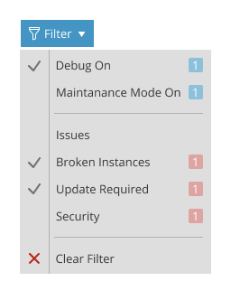
When a large amount of data needs to be filtered by multiple parameters, a filter panel can be created. Such a panel can be a part of the screen containing the list as can be seen on the WordPress Plugins and Themes window.
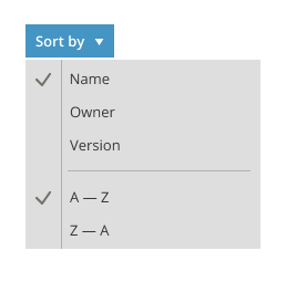
Sorting
For the lists displayed in the form of a table, the objects can be sorted simply by pressing on the corresponding column header.

For the card lists, there is a special dropdown list, which allows for sorting the objects according to the parameters it displays.