Modal Windows
Modal windows are used for interacting with the user while preserving the original context of the current window. Plesk supports the following types of modal windows.
- Dialog window (including a Progress dialog),
- Drawer,
- Popover.
Dialog window
Dialog windows are used to facilitate a dialogue with the user. Usually, the user is asked whether a certain action should proceed or how it should proceed. A dialog window can be shown in response to an action performed by the user, for example, removing important objects that influence the operability of something). Another situation when a dialog window can be displayed is in the course of execution of an operation, for example, asking the user whether to install plugins after WordPress has been installed.
Note: Do not use lengthy forms and texts in a dialog window. Instead, use a drawer.
Dialog windows can be split into the following categories: informational, confirmation and suggesting.
Informational dialog
The informational dialog communicates to the user facts that the user has no control over. Such dialogs contain a header, the text message and the Close button.
Example: The user is copying files. Before executing the operation, the system learns that there is insufficient disk space. The user is shown the following dialog window.

Confirmation dialog
The confirmation dialog informs the user of the current situation and asks the user to confirm how to proceed from here.
Example: The user is copying files. There is not enough space, but the user can choose to free up the required space.

Suggesting dialog
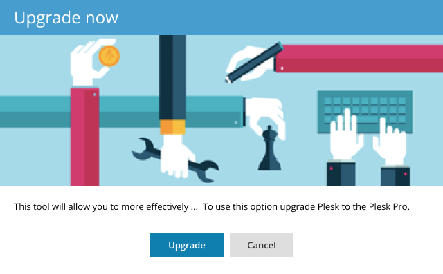
The suggesting dialog recommends products and services to the user.
Example: The user sees an interesting paid feature in a product. They want to know what they would get in exchange for their money. The user presses the button and sees the window that tells them of the advantages of this particular instrument and provides the ability to make the purchase.
Progress dialog
Progress dialogs help to keep informed of the progress of the ongoing processes that take significant time to complete. They contain information about what is happening, how long it may take, and an optional way to cancel the process. A progress dialog must have an ability to be minimized in order to not get in the way of the user’s work. The process itself continues unchanged in the background.
- The minimized progress dialog must be present on the screen in the lower right corner in the form of a small plaque, showing the progress indicators – time, volume, etc.
- There must be a way to expand the progress dialog from its minimized state.
A single process may have a progress dialog like this:

The user can see what operation is being executed and the progress of that operation in the form of a scale and a progress indicator.
If a process consists of a number of stages, its progress dialog may look like this:
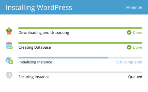
The shown progress may be either determinate or indeterminate.
Determinate progress
Progress is determinate when it is possible to show exactly how much is complete and how much remains.
If it is impossible to calculate exact volume or time or other indicators on which the progress display is based, it is possible to use a model progress, which can be based on average values and approximate the indicators.
Indeterminate progress
This type of progress indication can be used when it is impossible to evaluate the progress of the ongoing process even approximately. Also, it can be used when calculating time or volume before launching the determinate progress.
Using illustrations
If the sense of the process can be relayed in the form of an illustration – it may be done. If it cannot – do not use an illustration.
Note: Icons and illustrations are optional elements of the dialog window.
Interrupting progress
Optional. If the process can be canceled (the object returned to its previous state), include the cancelation button.
Displaying errors
In the course of the process execution, errors may appear. The errors can be critical, when it is impossible to continue further execution, and non-cricial – the execution may proceed but the user should be informed.
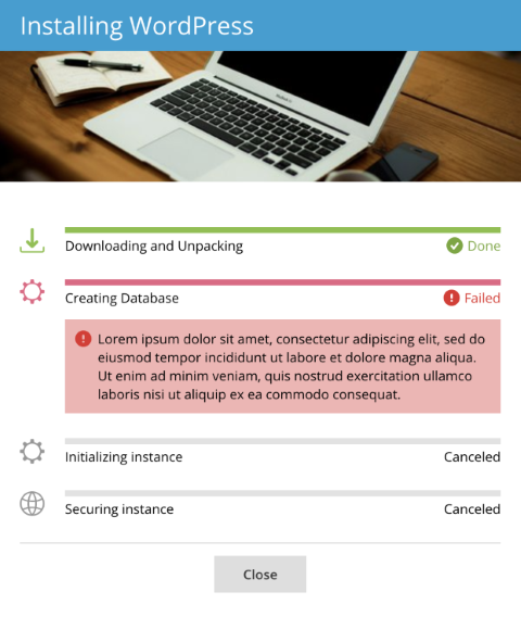
- In case of a critical error, the process is halted. The user must be provided with the text describing the problem and informed of the options available to them.
- If the error is non-critical, the text about the problem must be displayed and highlighted orange, and the process continues.
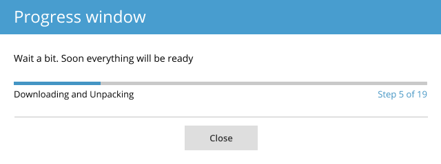
Multi-step progress
If the process consists of more than 5 stages, displaying them all is unnecessary. The right way to implement this is to show a single progress for all the stages, and indicate which of the stages is being executed presently.
Drawer
The drawer is a modal window, which opens on top of the page and takes up the entire height of the browser window.
Usage
- Use a drawer when you need to preserve the context and display a large quantity of data.
- A drawer can be used for lengthy forms, since a drawer takes up the entire height of the window, and the vertical scroll is placed by the content.
- One drawer overlaying another drawer works and looks well. It is therefore acceptible to use second-tier drawers.
Note: Do not use drawers for short messages and confirmations. Instead, use dialog windows.
Example: basic drawer.
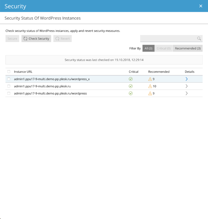
It displays a list of instances and available operations, and filtering and search operations. Pressing on an arrow for a specific list entry takes us to the that object. The header describes what kind of drawer this is, and the subheader explains exactly what information is presented at this level.
Example: second-tier drawer.

This second-tier drawer displays data pertaining to the object selected at the previous, first-tier drawer. Each item here can be configured. The header shows where we have come from and provides the means of returning. The subheader explains the presented information.
Composition
The first-tier drawer consists of the following elements:
- Header
- X button (close drawer)
- Subheader
- Content area
- (optional) Footer, may contain form submit buttons.
The second-tier drawer overlays the first-tier drawer and consists of the same elements. It differs in that instead of the X button in the header it has an arrow button, which takes the user back to the first-tier drawer. Closing both drawers from this level is impossible.
Action
The parent page is darkened. This switches focus to the drawer and indicates that the interaction with the parent page is now impossible. The drawer can be closed by either pressing the X button in the header or by submitting (or canceling) the form. Pressing anywhere outside the drawer does not close it.
Popover
The popover is a context pop-up window, which allows for in-place editing or showing informational messages. The popover does nto block the user’s interaction with the parent page.
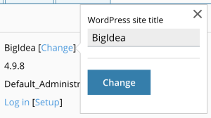
Example: editing a text field in-place.
Example: editing a form.
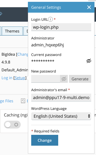
Here, the popover contains a header. The contained form is large enough to require an explanation.
Note: If a drawer (or any dialog window) contains input fields, the focus at the opening must be on the first input field.
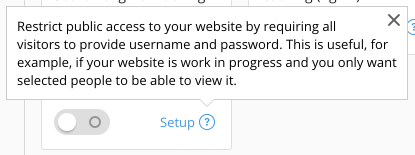
Example: a tip.
Note: Any of the above windows can be closed by pressing the Esc button on the keyboard.