Navigation
Main menu
The main menu is located on the left side of the screen and enables navigation among the main functional sections. The structure and contents of the Main menu depends on the selected Plesk view mode: Power User and Service Provider.
| Power User | Service Provider |
|---|---|
 |
 |
- Power User view is designed for the web professionals and web admins who use Plesk to manage a server for their own needs.
- Service Provider view is designed for users who sell hosting services.
More information on the different interface view modes is available here: The Plesk GUI.
Path bar
The Path bar is displayed at the top of the page, above the page title.

Its function is to display the exact place of this page in the hierarchy of navigational structure of Plesk. It also allows to quickly navigate to higher levels by clicking on the corresponding elements.
Note: The Path bar works differently from “breadcrumbs”, it does not represent the history of user’s navigation.
The Home element of the Path bar is unavailable in the Power User view mode.
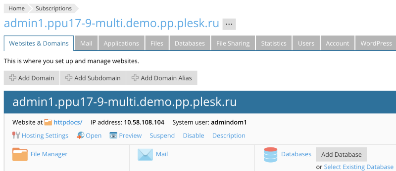
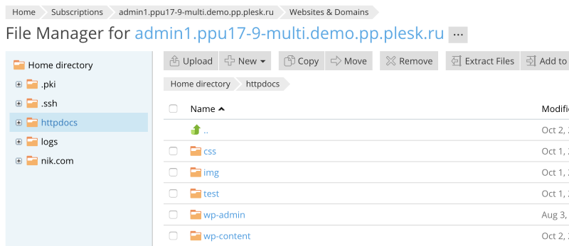
Sometimes, the forming of the path is a little more involved. For example, if we start at the Subscriptions page and go to a page that is part of a specific subscription (e.g., File Manager), the Path bar will be extended with the name of the selected subscription following the name of the tab that contains the link to the selected page.
Example: The Path bar at the Subscriptions page.
Example: The Path bar at the File Manager page for the corresponding subscription.
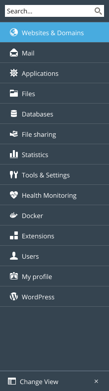
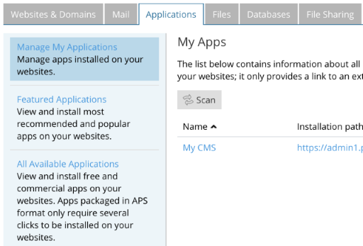
Side bar
The Side bar is located on the left side of the page. Similar to tabs, the function of the Side bar is to group the content by type and to enable navigation among the groups.
The Side bar must be used in the following cases:
- The groups require description,
- There are too many groups to use horizontal tabs to represent them,
- The horizontal tabs are already present on the page and further grouping is required as in the example below.
Internal links
Internal links are used to quickly direct a user to one of the product pages.

Visually, the internal links are indistinguishable from external links.
Object switcher
The Object switcher appears immediately following a name of an object like a subscription or a customer account. It is used to switch between objects of the same type.

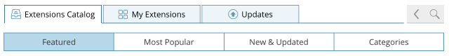
Tabs
The Tabs bar appears at the top of the page, just below the page title.

The tabs provide the ability to quickly switch between different sections of the same page.
Avoid using too many tabs. Do not place two rows of tabs on a page or let tabs carry over into a second line.
There are other means of further organizing information on a page, like Subnav.
Use tabs strictly for navigation. Clicking a tab can only lead to displaying new information, it cannot be used to execute an action. When naming tabs, use nouns that best describe the corresponding content. Do not use verbs to name tabs.
Subnav
The Subnav is an auxiliary navigation element, which can serve as a second line of tabs, where necessary.
Page title
The Page title is displayed at the top of the page and explains what kind of information and controls this page contains.

The Page title may contain a link in it, which leads to a page that contains information on the corresponding object.
The Page title may also contain an Object switcher.